Photon Application Counter Analytics
Access Photon application counters from the app list on your Dashboard.
Following the analytics link for any of your applications will get you to the Photon counter data for that application.
General
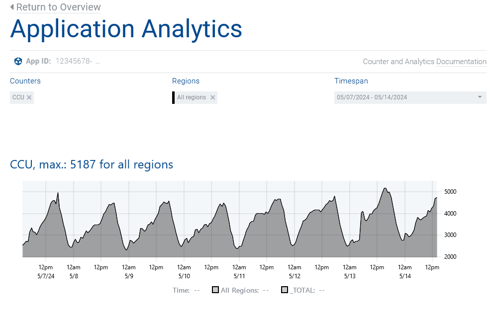
Analytics start with a single counter, CCU.
You can select from all counters to show in addition or as any set as you define it.
The last selection will be persisted in your browser so you can start off where you left upon your next visit.
We differ between data - the raw, actual counter numbers - and graphs - interpreted data showing as images.

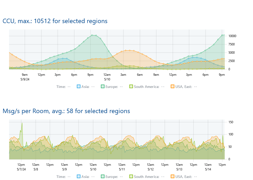
Each graph reveals ...
- at the bottom: the caption composed of the counter name (optionally followed by the aggregation function - 'max.' for maximum or 'avg.' for average) followed by a reference value in bold - that value will be the "Overall" value if that "region" is selected (see how "Overall" is calculated here) or a custom value per counter,
- data values on the vertical axis,
- data timestamps - render in 24 hours where shown and for the UTC timezone, each - on the horizontal axis,
- each region in a different color within the graph - the region color is indicated in the regions' selection field itself.
In all graphs, except the "Traffic" one, the maximum value within the shown timespan shows as a horizontal line for each region, re-using that region's color.
Available Application Counters
CCU Peaks
Shows the current CCU peak of the selected period for the selected region(s).
Users - or players - add to the CCU counter when they enter the lobby and start a game, joining a room.
This is what your app's subscription plan should match.
Bandwidth/s
Shows the average bandwidth consumed by your app.
Bandwidth/s per Peer
Shows the average bandwidth consumed by a peer in your app.
Traffic
Shows the gradients of the incoming plus outgoing traffic totals on your game for each region.
This accumulates the total traffic that your app consumed in the queried timespan.
If your app exceeds the included volume for a month, overages apply.
Disconnects/h per Peer avg.
Shows the ratio of non-client-requested disconnects per second and peer.
Analytics
Filtering Application Data
Use available filter options to narrow down the shown data to
- select specific counters,
- show a single or multiple regions and
- see different timespans for a look at former events.
Do not forget to click "Apply".
Zoom in on any counter to reveal each data point.

We persist historical data up to one year for each app and counter.
The resolution of data points decreases the older the data get.
For counter data aged up to
- 6 hours the resolution is 1 minute,
- 1 day the resolution is 4 minutes,
- 1 week the resolution is 30 minutes,
- 1 month the resolution is 2 hours and for
- 1 year the resolution is 1 day.
Each archive is a cyclic buffer and is updated in a rotating manner as new data arrive.
Custom Analytics
As your audience grows you might want to take a different look at your game data.
We provide you multiple options to view other than the graphs we provide you in your dashboard.
Counter API
The Photon Cloud Counter API allows you to read application counter data and graphs remotely.
Access is available with Premium and Enterprise plans.
"Bandwidth" vs. "Traffic"
Intentionally, we differ between the traffic (referred to as the amount of bytes consumed by your application in the queried timespan or "volume of the pipeline") and the bandwidth (referred to as bytes per second your app is using or "the pipeline's diameter").
"All Regions"
When you choose "all regions" from the regions select, a new graph will show in addition to the other regions selected.
For the application counters , "Bandwidth/s per Peer" and "CCU per Room" it shows as the respective average for your app across all available regions.
It represents the average of all values of the same counter across all available regions.
Other charts render "all regions" as the topmost graph.
It represents the sum of the values of the same counter for all available regions.
Hey, there is a "Cliff" in my Chart?!
Such a "cliff" or vertical line at the end of any graph does not indicate an error but only the counter data not yet rendered for the end of the timespan queried.
E.g. with the queried timespan being the last hour (or smaller) - from 60 minutes ago up to "now" - it will happen regularly that the counter data for the current minute (see counter's resolution) are still being processed.